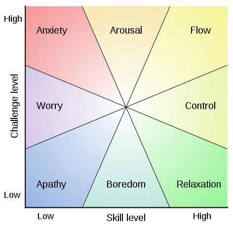
Flow, also known as Zone, is the mental state of operation in which a person performing an activity is fully immersed in a feeling of energized focus, full involvement, and enjoyment in the process of the activity. In essence, flow is characterized by complete absorption in what one does. Proposed by Mihály Csíkszentmihályi, this positive psychology concept has been widely referenced across a variety of fields.
Ok. That’s the official Wikipedia definition. But what does that mean? Let’s look at it this way. Do you remember a time when you were working on something so engaging that time seemed to disappear? The next thing you know, the sky is dark, you’ve missed dinner, the wife and kids (or whoever fits this category) think you may have died because you’ve been so quiet? Yes. That feeling. That’s FLOW.
Optimal experience. Hyper focus. Spontaneous joy. So many phrases. All trying to capture the essence of Flow. Some call Flow the secret to happiness. That is, if you can find that place where things just “Flow” (I know, using the word too much. Bear with me a minute, we’ll get there) find the place where your mind is engrossed, challenged, fulfilled, we will indeed find a state of happiness (not permanent mind you, that’s more than I can promise.)
To break it down even further, Flow can be summed up as a perfect balance of two components; The old and familiar paired with the new and challenging. I know I am over simplifying what is a very complex idea. But at the core, it really is quite simple. If your life has too much of the old and familiar, you become bored and complacent. Too much new and challenging and chaos reigns. Ideally, Flow is the perfect balance, for you, of just enough familiar and comfortable to give you confidence, mixed with enough new and challenging to cause you to grow. Find this perfect balance, and there you have it. Happiness. For a while at least.
What does this have to do with design and UX you ask? Everything. As we create new experiences for users, we need to take the concept of Flow into consideration. Have we made the UI too predictable? Are we asking the user to learn a new visual paradigm? If we are creating experiences that are meant to engage and retain an individual, then we need to find that balance of familiar and new, comfortable and challenging. Enough to keep the engagement level high, and get the Flow, flowing.
The secret to Flow. Balance challenge with existing skill.
